
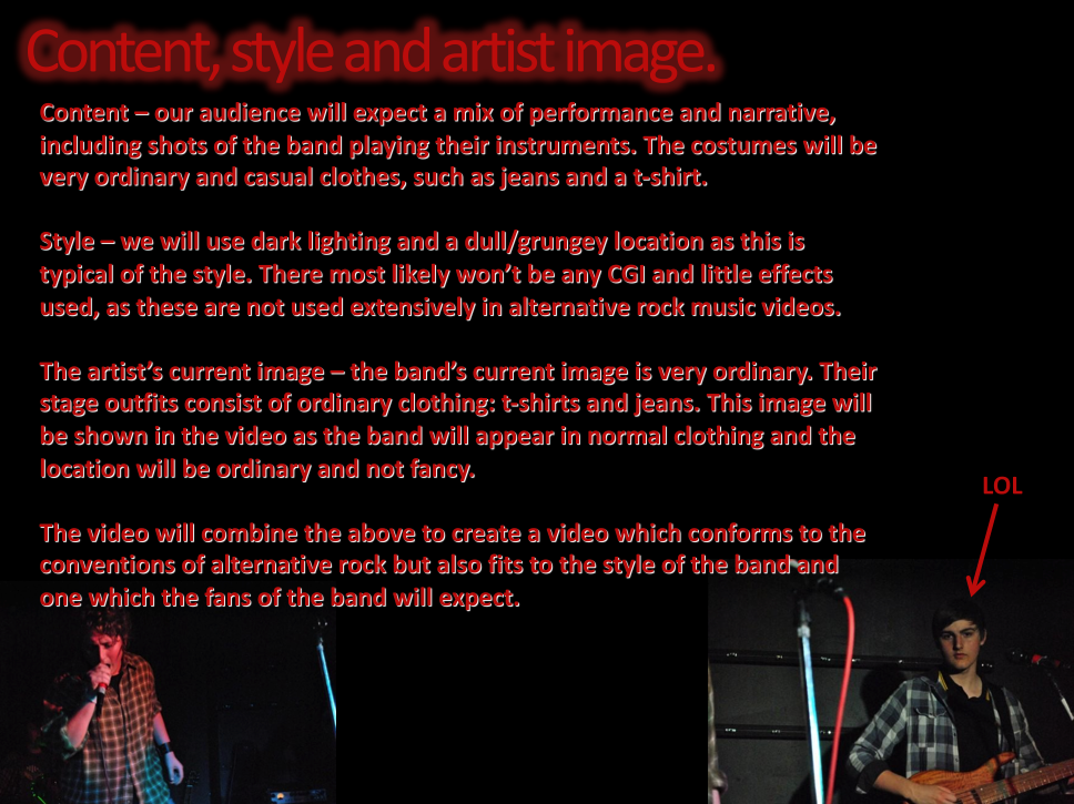
Friday, 26 November 2010
The Music Video So Far
We have now almost finished the intro section for the video and we'll be filming the narrative part of the video on Monday or Tuesday. This is a screen grab of what we did today.

Tuesday, 23 November 2010

Website Update
This is what we have done so far on the website. We have added a login option and news posts, as well as the tour dates and various layout changes. We feel that the website is coming on well and that it looks good and reflects the band's image.


Tuesday, 16 November 2010
Website Update

Tuesday, 9 November 2010

Permission Forms


Wednesday, 3 November 2010


Tuesday, 2 November 2010
Cover Research 5-It Prevails


The cover of It Prevails 'Capture and Embrace' is approptriat for there genre of Hard Rock because you see the side of the cilf crumbling and the background becoming darker. Dark and synyster things are normally associated with Hard Rock and Metal. Throughout the Digipak the pictures of that clif side and field are repeated. Along with the pictures the the main logo and text style is also repeated on every part of the cd so it really sticks in your head! This cd would stand out from any other cd for its immense use of colour and effects so it would be helping the band to become more well known with its eye catching Digipak.
Cover Research 4-The Mercury Men


The Mercury Men's album cover follows the genre of folk/rock with a prainted arty picture on the front, its obvious that this band isnt botherd about there image and that they only care about the music. The cds layout is very simple with pictures of the band looking chilled and text following the theme of the dark red background, this creates a warm effect and a understanding that this is a nice slow band with songs you can chill out to.
Cover Research 3-Blink 182


The Blink 182 'Take of Your Pants and Jacket' album is very appropriat to the Punk Pop genre, its silly pictures along with the lyrics in the inside sleeve give you a idea of what this band is all about. The cover is mainly back with a repeated pattern of there album logo along with there name. The main layout is the same for everything apart from the back cover which is plain white with a promotional picture of the band and the tracklist. This lets you see whos that band are and what they look like. Both the image and style sell this band because most of the fans could relate to the members because they look like there target aduience.


Rob's Summer Homework

Website Analysis and Research 5 - Foo Fighters

Very little representation of band is used on the homepage for the Foo Fighter's website as has no band logo or even the band's name. It has links to the band's news, videos, tour dates, Twitter, fan space, FaceBook, merchandise, biography, their music and a discussion board. The band use no advertisment to third party websites but do you social networking websites to promote the band and increase their fanbase. The simple picture of the band's instruments and equipment in a typical garage lets the target audience of teenagers and early twenties relate to having their own band and promoting idea that the target audience can be like them. The font is simple and the link based layout is a bit confusing and doesn't appeal to me as a homepage for the band as it doesn't give any images of the band at all.
Cover Research 2-Foo Fighters


As Foo Fighters are a typical rock band this artwork fits well for there genre. Everything about this cd is simple the artwork, colours and font. The image on the front relates more to the album title 'The Colour and the Shape' than the rock genre. The colours that are used do have a good effect on the eye, the dark blue, grey and bright red stand out even though its simple. The text is used so that everyone knows that this is a Foo Fighters album because of the big Logo/Font in the middle of the cover. This cd cover isnt the most eye catching cover but because of how well known the band is anything thing they do would be remembered.
Website Analysis and Research 4 - Red Hot Chili Peppers

Website Analysis and Research 3 - Nirvana

Website Analysis and Research 2 - Radiohead

Storyboard


In our music video we will use a variety of shots and angles. The storyboard will help us when we are shooting and editing our music video to ensure we are shooting the right material and editing it in the right place. It also helped us to develop our original idea and to give it structure. We wrote the storyboard in class and then Gabe finished it at home.
Website Analysis and Research 1 - Blink 182

Advanced Portfolio: Band Webpage and Digipak Design Template


Digipak Cover Research
The cover art for our digipak will be of a long road which stretches into the horizon. The land surrounding the road will be baron and without life. This is to reflect the theme of the song, in that it is a struggle to go to sleep/struggle to keep walking down the long road. It is 'in his way' between him and what he wants. The logo of the band will be at the top of the cover with the title of the single written underneath.
The back of the digipak will be simple, as the road on the cover art is surrounding by baron landscape, we feel that if there is a lot on the back cover it will not fit in with the theme. It will contain the tracklist, including the music video which we are making for "In My Way". The back cover will also include the MySpace address for Alaska's band profile and the logo for their record label "Hit And Run Records".
Inside will be a booklet and a photo of the band with the lyrics printed underneath. The overall colour scheme will be dark and the photo of the band will reflect their rock influences. The lyrics will be included so that the people who buy the CD can read and interpret the song how they want to, but can also understand the theme of insomnia. The picture on the actual CD will be simple, with just the band's logo and "In My Way" written underneath.
Subscribe to:
Comments (Atom)